The allure of a mid-century modern colour scheme lies in the flexibility it affords in experimenting with a wide range of hues, from warm yellows and vivid pops of colour to earthy, subdued shades. These go together excellently, though you should aim to choose a colour scheme that emits the correct ambience of vibrancy and comfort.
The period has so many overlaps and draws inspiration from a selection of different styles including retro, plant havens, and minimalism. All of these can shape the aesthetic you’re looking for.
13 Mid Century Modern Paint Colors to Inspire You
We’ve picked out some of the best paint colors by Sherwin Williams to create the perfect mid century modern look, no matter what style you’re going for.
1. Chartreuse (SW 0073)

Chartreuse is the perfect color for adding a touch of citrus and zest to your walls. The soft golden yellow tone has some underlying green to it which is perfect for adding a muted yellow to your walls without being too bright and intense.
Yellow is a color we naturally associate with fun and happiness so the warm hues of Chartreuse will create a sense of liveliness. This color will work great in communal rooms so is ideal for a mid century modern living room.
2. Holiday Turquoise (SW 0075)

Holiday Turquoise brings in a punchy vibrant color that beautifully contrasts with the neutral shades. While this shade can work on the walls, its slightly bold color may be overwhelming so we think it works brilliantly as an accent for ceilings and kitchen cabinets.
If you have any aqua colors in your wall art, decor, or furnishings, Holiday Turquoise pairs beautifully to add a fun atmosphere to your room. The cool tones of the turquoise also pair best with neutral colors.
3. Flamingo Pink (SW 0080)

This color does exactly what it says on the tin. Unlike Holiday Turquoise which has a cooler undertone, Flamingo Pink has a bold warm undertone to add some life to your room. This is also one of the many exterior paint colors you can try to add some mid century modern accents to the outside of your home.
Due to the vibrancy, Flamingo Pink is best used as a shade for accents as opposed to walls so it’s not too overbearing. We recommend trying it out on kitchen cabinets or even on an accent wall for a pop of retro color.
This shade pairs best with warm neutrals or even whites.
4. Classic French Gray (SW 0077)

Classic French Gray is a dark gray shade that can match with just about anything. As it’s a darker color, a bold or pastel shade can complement it beautifully.
A lot of the mid century modern style revolves around minimalistic furniture and decor, so Classic French Gray brilliantly fills that void. It can work nicely on walls, doors, and accents.
Classic French Gray is best suited for communal rooms such as dining rooms and living rooms to create a calm atmosphere. Although, we recommend pairing it with another color so your rooms don’t end up looking too dark or dreary.
5. Cheerful (SW 6903)
Cheerful is exactly what you imagine it looks like. Whereas Chartreuse is more of a golden yellow with a hint of green, Cheerful is a bold and bright yellow. For that reason, we do not recommend it for covering entire walls as it can be a strain on the eyes.
However, Cheerful can be complementary when matched with furniture, pop art, or other bold wall art, especially on accents for drawers and doors. As mentioned, this can work on walls especially if paired with neutral tones or even white for a splash of the retro aesthetic.
Naturally, Cheerful can warm up any room, so it works brilliantly for darker spaces or those that you feel need a bit of TLC.
6. Kid’s Stuff (SW 6893)

If you are looking for a burnt orange shade for your mid-century modern room, then Kid’s Stuff is a great choice. The color is bold and is suitable for livening up a room with a warm shade.
Kid’s Stuff can work in just about any room as the vibrant color can add some character to your walls or be used on accents without being too much.
Plus, the warmth of the orange can work well with mid century modern wood tones which are also typically warmer. This color palette also creates an autumnal look without feeling too imposing.
Kid’s Stuff can complement the loud colors found in mid century modern decor like wall art and rugs.
7. Hep Green (SW 6704)
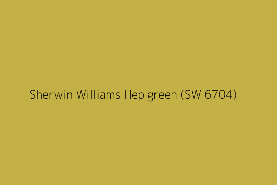
Hep Green is another bold option with yellow undertones. As the color isn’t too dramatic, Hep Green is a versatile option that you can comfortably cover your walls in or use on architectural details.
The shade is quite neutral and earthy so it can work well in all rooms, from your bedroom to your dining room. As there is some pigment to it, we would not recommend pairing it with a similar shade or a bold shade as they are less likely to complement each other.
Instead, Hep Green complements white shades to create a homely and friendly atmosphere.
8. Gala Pink (SW 6579)
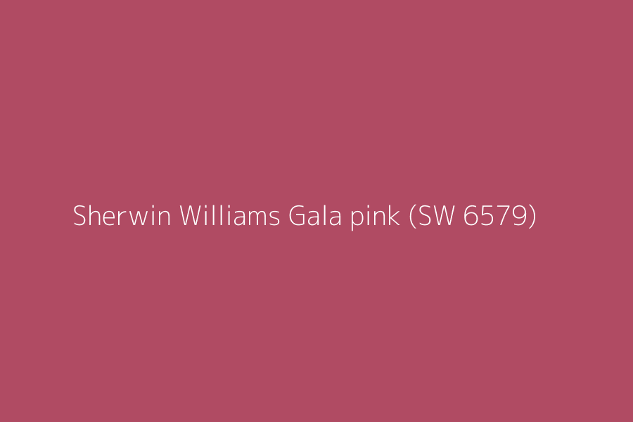
Gala Pink is a gorgeous flexible color that is perfect for walls as well as for adding a pop of color to appliances and storage units.
The shade isn’t too loud and bright but still packs a punch especially when combined with a soft color palette. The fresh hue of pink can comfortably match accessories such as towels, wall art, and rugs due to its versatile tone.
The color can work well in a range of rooms from bathrooms to bedrooms.
9. Pure White (SW 7005)
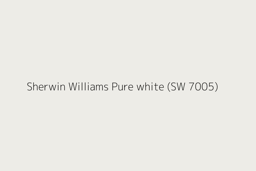
If you’re looking to go back to basics, Pure White is a great option for creating a soft background that can be combined with a variety of bold, pastel, and darker shades to create your perfect mid century modern haven.
White is commonly associated with minimalism so Pure White is a great option if you are wanting to draw the color into your furniture and accessories. Also, white trim and white accents can create a modern and contrasting look against bright reds and dark brown shades.
Pure White is a safe option and popular choice for creating a balanced mid century modern color palette.
10. Black Magic (SW 6991)

On the flip side of Pure White is Black Magic which is a great option for pairing with white trim as well as pastel, earthy or bold tones to create an ideal mid century modern color palette. Black is known for working well with gold colors too for a pop of glamor.
Black Magic is a versatile color so it can work well in all rooms from the kitchen and living room to your storage furniture. It is best to avoid matching black with a dark tone as it can make your rooms appear as though they’re lacking light, therefore opt for colors like bright red, burnt orange, or pastels.
Being one of the key mid century modern paint colors, black works great on features such as ceiling fans and lights to add a contemporary and minimalistic feel to your room.
11. Blonde (SW 6128)
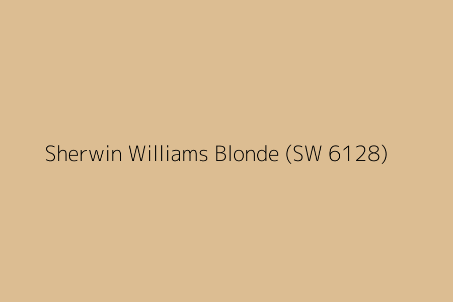
Blonde is a fantastic soft neutral color that can work just about anywhere, whether on a wall, door or for features. The versatility of Blonde is ideal for interior as well as exterior painting, plus it can pair brilliantly with most colors especially brick reds, or it can just be used on its own.
As Blonde has a warm earthy hue to it, it can complement the brown tones of wood which is commonly used in the mid century modern style, namely for desks and tables.
Generally, we’d say to avoid pairing Blonde with light shades as your room could look washed out, but dark, vibrant, and bright colors complement it well.
12. Amazing Gray (SW 7044)
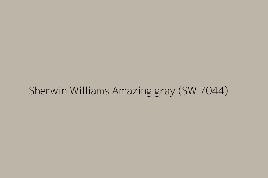
Amazing Gray is a neutral taupe color that is another great choice if you’re looking for a cooler tone. The flexibility of Amazing Gray can work well on interior and exterior walls, appliances, and furnishings.
Due to the neutrality of the color, Amazing Gray can be easily paired with home objects such as cushions, rugs, and wall art. On the walls, the color works well with similar cool tones such as purples, blues, and greens.
This color is ideal for creating that minimalistic mid century modern look for your home.
13. Copen Blue (SW 0068)
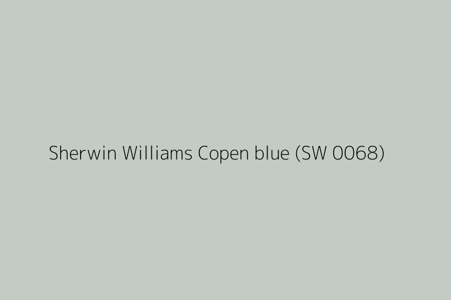
Copen Blue is a gorgeous paint option if you are looking for a muted tone with a hint of color. The blue works well on the walls, doors, and home accents such as kitchen counters. It can also pair nicely with dark cool-toned shades to create a calming atmosphere in your home.
Likewise, Copen Blue can complement similar tones in your furnishings and home features such as art, rugs, curtains, and cushions. The softness of the blue can create a flattering and versatile mid century modern color palette without being over the top.
Overall, Copen Blue is an excellent choice if you’re searching for the flexibility of neutrals, but want a hint of color.
Final Thoughts
Overall, mid century modern is an adaptable design style so you can create a color palette that fits your tastes and surroundings, whether that be bright and loud colors, toned down neutrals, or relaxing cool shades.
We hope our paint guide has served as some inspiration for your mid century modern home overhaul, no matter what you are looking for.
FAQs
Is teal a good mid century modern color?
The right hue of teal can bring a sense of playfulness and liveliness to your home, which is reminiscent of the vibrant colors found in pop art. Pop art is commonly integrated with the mid century modern style if you are opting for a retro look.
The Holiday Turquoise we mentioned is fantastic at delivering that cheerful aqua color without being too saturated and harsh on the eyes.
Which mid century modern paint colors work well together?
It can be hard to know exactly what colors will complement each other until you get down to painting. However, an earthy brown tone can pair well with a rusty or burnt orange color for a warm palette that gives a cozy and friendly impression.
Likewise, teal and white make an excellent pairing for a soft beachy look and a calming upbeat atmosphere.
Earthy brown tones can also work excellently alongside greens for a laidback and forest-like impression. The browns are notably complementary to the use of wood such as in your furnishings.
Cool-toned grays are able to pair with dark as well as bold colors to balance out the hues.
Is design from the mid century modern era likely to stay in fashion?
Mid century modern is a timeless style but trends still fade in and out, and mid century modern is unlikely to be an exception. Although it shows no signs of slowing down just yet, some people love the style as it’s nostalgic of childhood, whereas others see it as unique and sleek.
Regardless, the style has modernized with our current technology, but the architectural feel is still maintaining its popularity.
How do I choose the right mid century modern color palette for my house?
Firstly, consider your personal tastes and interests as there’s no sense in opting for a color palette you don’t like. Next, consider your furnishings as you want to try to match the palettes to your existing furnishings and home decor unless you’re planning to change them.
If you’re unsure, the best place to start is by identifying what tone you’re looking for, cool or warm? From here, you can begin building a palette that incorporates the look you’re aiming for.
Also, consider what part of the mid century modern style you’re going for as there’s retro and minimalism, for example.
From here, you should be able to narrow down to a selection of paint colors that best suit your goals and environment.
Need help growing your interior design business?
Join our community to network with other designers, get ideas, and learn how to get more customers.

